Goldman Sachs says gold will go down $500: LOL

The Financial Post has repeated a Business Insider article about Goldman Sach’s prediction that gold will go down $500.  Here is my comment:

The National Post loses credibility with these Business Insider “articles”. Henry Blodget, the founder of Business Insider lost his right to trade in the US when he openly pumped dot.com stocks but then said privately that they were worthless. Others are just partisan hacks who write anything to make the Obama administration seem credible or the US economy seem stable.

The facts are that the interest rate can’t go up because that would cause the economy to collapse. The United States can’t stop monetizing its debt because it has too large a debt, too large a budget deficit and unfunded liabilities in excess of 60 trillion dollars. So the factors which cause the gold to go up are actually becoming stronger not weaker.

Goldman Sachs is one of the banks that is trying to manipulate the price of gold down, and their report that gold will drop $500 is a case of short and dump on–i.e., the opposite of pump and dump–in short and dump on, you first short something, then you loudly claim as publicly as possible that it is going to go down for whatever reason.

When I went to the Canadian PMX in December there were no one oz. coins or bars of gold or silver. They said they would have delivery in January, which they did around the second week. Get it while you can. Imagine the price of gas went down to 50 cents a litre but you went to the gas station only to find out that it was going to be a couple weeks or more before they had any gas. Well, a lot of good it does to have falling prices if there is none to be had. The prices of gold and silver are manipulated and the world markets are a broken price setting mechanism. That is because of the large short positions (paper gold) sold by the bullion banks. While there is abundant paper traded every day, the actual physical gold and silver is scarce.

Business Insider does it again: Media malpractice

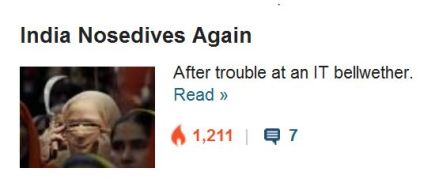
In previous post, I’d mentioned how a picture of an native in my hometown of Anchorage, Alaska, did not fit the Business Insider’s narrative.  I don’t know where these folks get their pictures.  The screen shot looks like this appears on the headline to an article by Joe Weisenthal:

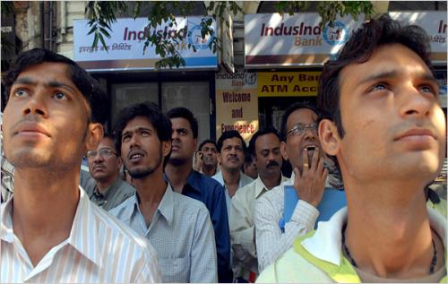
It doesn’t really look like the India Stock Market to me.  That looks like this (click on image for source):

]

Notice it is all men wearing shirts and no ties.  There are no veiled women wearing hats. No crescent moon knives.  The Business Insider provides images for their articles which are inconsistent with reality, but it does say something about their knowledge or rather their prejudices about India.  I wonder what the source of the picture is.  Furthermore, I wonder if it is indeed a picture of the India stock market as Joe Weisenthal’s use of it would suggest.  If anyone knows the source of the picture, please let me know.  If I am wrong, mea culpa in advance.  But my instincts tell me there is something wrong with this picture.

The Business Insider: the National Enquirer of Financial Sources?

Anchorage, AK, May 4 2005 (some rights reserved), click on photo for Flicker source

I’ve grown to really dislike the Business Insider.  I consult it regularly because for every two bad articles they provide a good one.  They provide excellent access to people like Peter Schiff, John Mauldin, Marc Faber and Gonzalo Lira.  But the tendency is for them to be liberal in orientation; so the editors themselves, while begrudgingly recognizing certain fundamental laws of economics, nevertheless are quite often shills for the Obama administration, the Democrat party, and Keynesian style economics.

But today a flicker picture appeared in their article on poverty in America and the increasing gap between rich and poor.  Gus Lubin writes:  ”

While politicians gloat about our “recovery,” our poor are getting poorer, our average wages are still falling behind inflation, and social mobility is at an all-time low.

Read more: http://www.businessinsider.com/facts-about-inequality-in-america-2011-11##ixzz16WCVJ23N

Now I wasn’t very interested in the charts and statistics that Gus Lubin wished to present.  I was interested in the photo of the desperate man with the sign saying “Homeless Please Help!”  and the background behind the man.  The scene was familiar.  If I’d seen it once, I’d seen it a million times:  Mt. Wolverine and the Chugach Mountain range which forms the backdrop of my home town Anchorage, Alaska.  I lived twenty years on the foothills of those peaks.  I went to Flicker which was linked to by Business Insider as the source of the photo.  The photo is from 2005 and is presumably of a native Alaskan.

Now this is just bad and unethical journalism.  The story of this photograph is not remotely related to the widening gap between rich and poor in America in 2010. Sorry.  Other narratives are more suitable:  Perhaps the man was a stranded Inupiat, Yupik or Athabaskan man, far from his village home–maybe he had a problem with alcoholism.  Who knows the story behind this photo?  It looks really sad.  But what does it have to do with the Business Insider article?  This man was standing at this Anchorage street corner five and half years ago, over two years before the recession even started.